Five Effective Ways to Control Color
A 50-year veteran in color-concentrate production and use shares practices to help you make better color decisions and generate less scrap. To specify color correctly and communicate your specs to your color supplier requires understanding of the “Five U’s.”
The overriding challenge in controlling color is how to convey accurate measurement correlation at different steps in the supply chain. We can liken this challenge to building a garage with only a stick to measure the dimensions for the garage. Unless you and your builder both have an accurate measurement of the stick in question, your specification of a distance of “1½ sticks” would not translate to the builder.
When measuring color, our primary correlation target must be the visual response. The final judgements on products are made by consumers using their eyes, since most people don’t walk around carrying spectrophotometers. These are the devices we in the color industry rely on for numeric measurements of color. So the visual response is the most practical criterion.
Our challenge is finding a measurement system that accurately and repeatedly predicts visual outcomes. Meeting this challenge means preventing false positives and false negatives from entering our decision-making process. False positives, when the measurement says your product is OK, but it’s really not, result in color rejections. False negatives, when the measurement says your product is not OK, but it really is, lead to discarding good product that is really visually acceptable. Either outcome is bad and will cost you a lot of money.
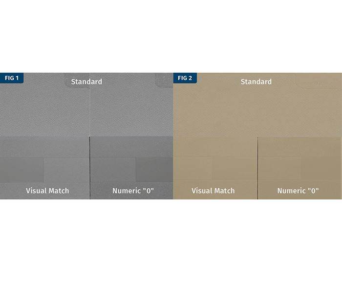
For a concrete illustration of this condition, take a look at the picture of the gray colored plaques in Fig. 1. You can clearly see that the visual match is much closer than the numeric match, which is set to numeric zero. Similarly, the beige plaques in Fig. 2 show a much better correlation between the standard and the visual match than the plaque that is set to numeric zero. Why might this happen?
1. UNDERSTAND WHAT YOU ARE MEASURING
To start, we need a good definition for color. At Americhem, we define color as what we see: the physical modification of light by an object as observed by the human eye and interpreted by the human brain. So let’s take a look at all of these aspects.
The first part of the definition is light. There are many, many different light sources, all of which have an effect on an object’s color. Incandescent light is very different from daylight, which is very different from cool white fluorescent. The reason is that each light source has a different spectral curve as observed by the eye; we refer to this as the “color” of the light.
The object itself is the next facet of color. We measure the way that light energy interacts with an object. We sometimes call this the spectral reflectance curve of an object. The physical and chemical makeup of an object has a direct effect on how it interacts with light.
Now let’s talk about the observer. There are two different kinds of observers: human observers and instrumental observers. These two types of observers process the information about color in different ways. Thus, the light source and the object are interacting with the observer to create what we call color. Remember our definition: Color is the physical modification of light by an object as observed by the human eye. Color is what we see.
Color is only one part of a larger group of stimuli, called appearance. Appearance is multi-faceted.
It includes the object’s surface characteristics, such as gloss, coatings, and geometry. There are also material differences, which yield different refractive indexes. Fluorescent material will also have an impact on the appearance and instrumental measurement of a sample. The surroundings of a sample (what the sample is placed next to) will affect its appearance. Even the temperature of an object can affect the appearance, through a phenomenon known as thermochromaticity. There is also the issue of metamerism, seen when evaluating two different samples under different lights, revealing a difference in appearance under one light source that may not be evident under the other light.
Of course, there are also the characteristics of the individual observer. No two people see color in exactly the same way, even if they have normal color vision.
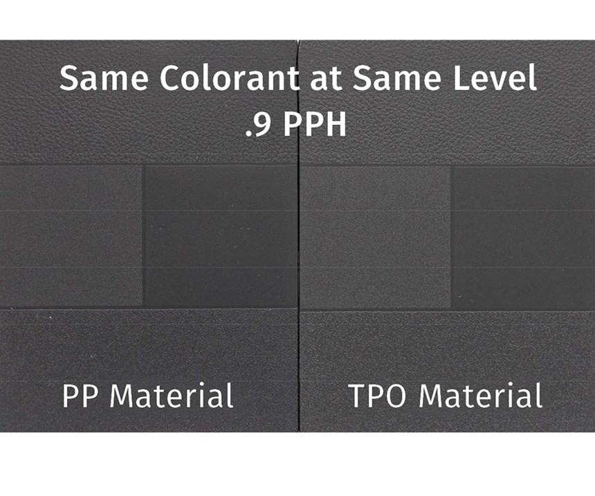
Consider the following examples. First, let’s look at two samples of different materials with the same level of colorant, 0.9 parts per hundred, as seen in Fig. 3. Looking at the two, you can see that they are different. The one on the right is lighter than the one on the left. The one on the left is made of polypropylene and the one on the right is made of TPO. When we measure, there are differences in the CIE L*a*b* and the Hunter Lab measurements.
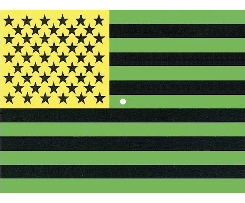
Another complexity is that of the human observer. Try the following experiment: Look at Fig. 4. Concentrate on the white dot in the center for the next 10 seconds. Then look away. What do you see? Is it a picture of the flag, but with different colors? This is caused by a circumstance called conecell fatigue. Cones are cells in our eyes that (along with rod cells) are photosensitive. When we strongly stimulate the cone cells, after a few seconds they begin to lose some of their sensitivity. It reduces one’s ability to assess color differences. Those cones that have not been stimulated respond more strongly than those that are fatigued. The result is that you “see” the complement of the color that caused fatigue. This is analogous to when you go into a very noisy room. When you enter, the sound is very loud, but after a short period of time, it gets quieter. The receptors in your ears want to reduce the energy coming into your ears. So they turn the ambient sound level down much in the same way that non-stimulated cones compensate for the fatigued cone cells.
2. UNDERSTAND VISUAL CORRELATION WITH MEASURED VALUES
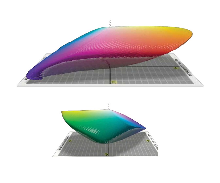
The definition of visual correlation is the degree to which two or more attributes or measurements of the same group of elements show a tendency to vary together. All of us have slightly different spectral curves; thus we see color in a non-uniform manner. When we plot this on a three-dimensional graph, we see color in a very non-uniform space (Fig. 5). The planar coordinates of a* and b* in the chart, and the vertical coordinate of L*, show this non-uniformity because our eyes do not respond uniformly across the color spectrum. They respond well in the center of the spectrum (green) but not so well at the ends (red and blue).
So what are the implications? First, we must incorporate the non-uniformity of our visual system into any measurement system we select. Secondly, this measurement system must predict the outcome of our visual response to all of color space.
3. UNDERSTAND YOUR MEASURING INSTRUMENT
Understanding the operation of your spectrophotomer is critical to measurement success. Read the manual! Have a clear understanding of all the instrument variables that affect measurement outcomes.
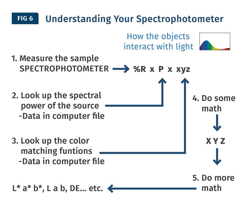
The spectrophotometer converts light energy interacting with an object into numerical data that gives you a reported spectral reflectance curve. The spectrophotometer converts our sample into numerical values that represent how the sample interacts with light. Look at this process diagram (Fig. 6). At the end of this process, the spectrophotometer gives you a numerical expression of the color (in terms of L*a*b* values, delta E values, etc.) The trick is getting these to correlate to the customer’s visual acceptability.
4. UNDERSTAND MEASUREMENT VARIABILITY
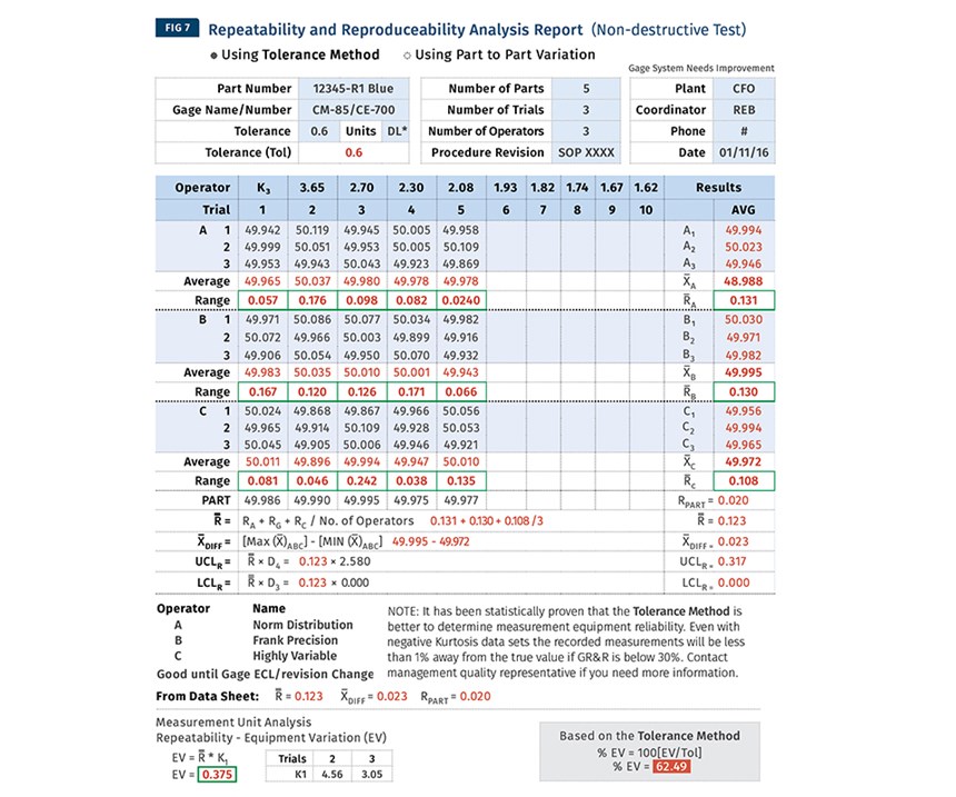
This is one of the issues that cause a lot of problems when making assessments. What is measurement variability? Very simply, it’s how much your measurements differ from one another (Fig. 7). In this instance, we measured a sample with certain tolerances. We measured five samples, three times by three different operators. The Gage R&R shows the total variability is wide, and that’s a problem when trying to get accurate color assessments.
How do we minimize our variability? First, we identify components of the measurement process. There is operator variation, instrument variation, sample variation, and other differences. Generally, the variability is not in the instrument, which tends to be very precise and accurate. Generally, the problem lies mostly in the sample preparation, the selection of samples and the presentation of the samples, particularly when you’re dealing with samples that have a surface that is not uniform.
The next step is to measure your variability with a Gage R&R test and determine the necessary action. If the error percentage is acceptable (between 10% and 30%), you move on. If not, you need to identify the major components of your variability. You need to examine the procedures and methods and conduct experiments to minimize error. Once you establish new procedures and methods, you should retest the results periodically.
5. UNDERSTAND APPROPRIATE SPECIFICATIONS
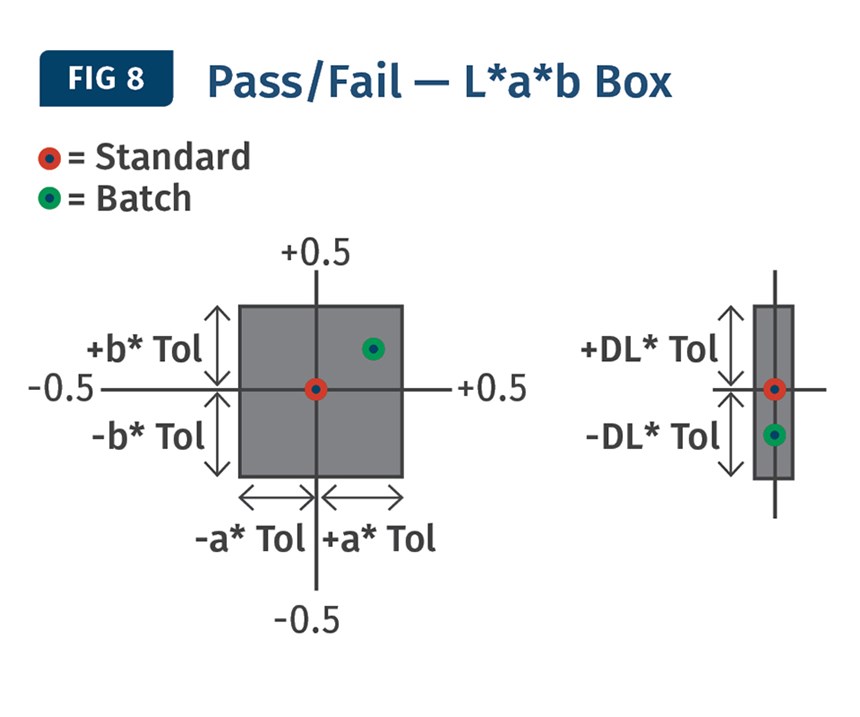
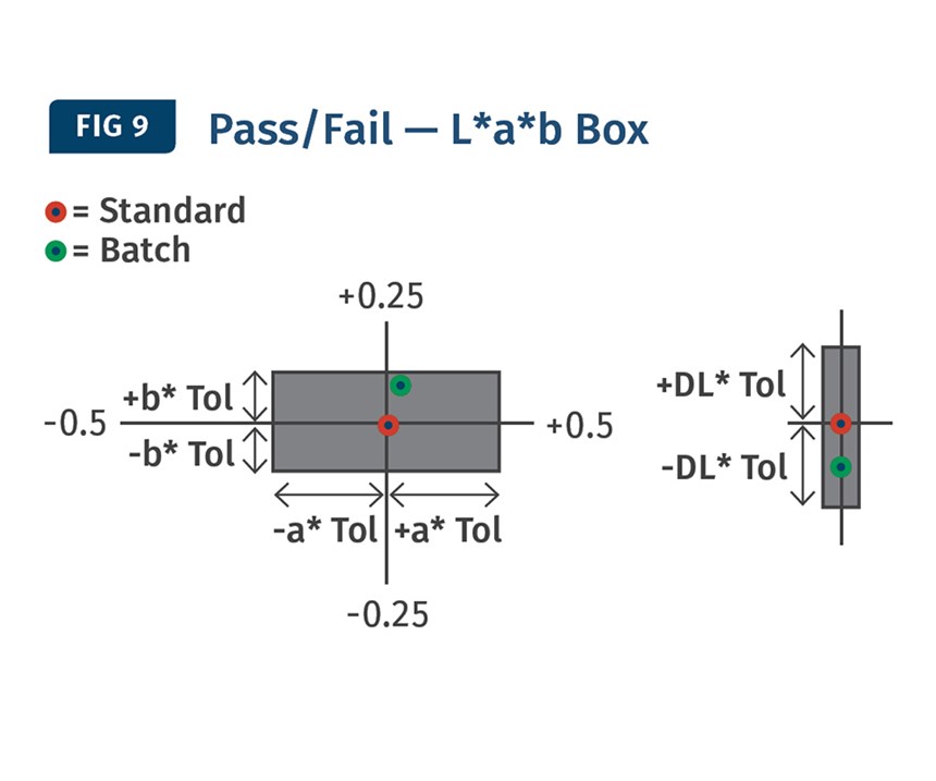
In general, there are several options available for depicting color on a coordinate graph: the box (or square), the rectangle, the sphere, and the ellipse. In the box example (Fig. 8), the tolerances are based on the values you set (L*a*b*). When you switch to the rectangle (Fig. 9), you notice that it provides an opportunity to have a more sensitive tolerance in the b* component because the space is not equal in all dimensions (± 0.5 a* and ± 0.25 b*).
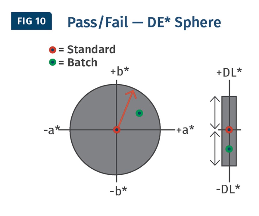
Next, we have the sphere (Fig. 10). This space, like the square, is uniform in dimension and only allows for equal weight on the a* and b* values.
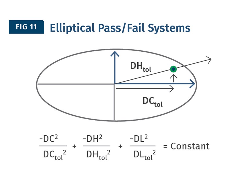
The final system is the ellipse (Fig. 11). The system is a variant of the sphere that uses hue and chromaticity, and like the rectangle it allows for unequal weighting of the primary components of color. The ellipse has been shown to more closely fit the human visual response to color, rather than the square, rectangle, or sphere.
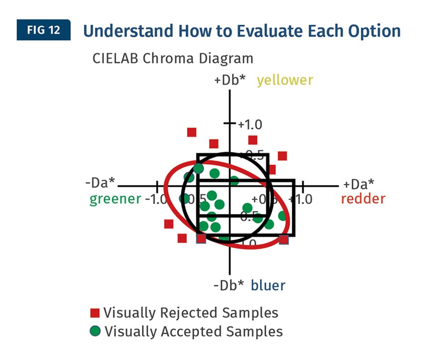
This is shown in Fig. 12. The green dots represent the visual response of an observer. If you use the square, you notice that there are visually acceptable samples that are not included. Thus, these samples are thrown away when they are actually visually OK. The rectangle yields similar results as does the sphere or circle. Each method keeps out the visually rejected samples, but excludes good samples. When using an elliptical system, we capture all the visually acceptable samples, but none of the bad ones.
So how do you get this to work for you? Review your rejection-acceptance correlation: How well does your numerical data predict your customer’s visual acceptance? If it’s acceptable to you, no change is necessary. But if you find it to be unacceptable, go to step two. Next, we plot your acceptance data and apply the system (square, sphere or ellipse) that works best to fit the data. Then, you apply that method, which is often the ellipse, to your tolerance protocol. From here, you continue to track and plot your future results, ensuring that you are continuously improving your process. It’s important to select the system that works best for you.
So, as you can see, we need to understand all five of our learning points in order to control color in our manufacturing and quality-control processes. What are the most common misunderstandings about the information we’ve reviewed? Of the “5 U’s,” most tolerances are set up based on the idea that if the number is off in one direction, it’s equally visually off in another direction, and this is not the case. If we don’t see color uniformly, how can our measurement system deal with it? In our example, it was the ellipse.
With a strong comprehension of these “5 U’s,” we can communicate color specifications effectively with our color suppliers and customers. Without the understanding of these five controlling aspects of color, we’re apt to waste a lot of time and money. By embracing these five factors, we’ve set the stage for understanding color throughout the supply chain, minimizing waste and increasing our sales and profits.
Related Content
Inline Inspection System for Wood Plastic Composites
Pixargus’ ProfilControl 7 DX WoodPlasticComposites measure all dimensions and geometrics, including deep grooves.
Read MoreUpgrade to Accelerated Artificial and Natural Weathering Testing
NPE 2024: Atlas’ S³T system is designed for the company’s Weather-Ometer Ci4400 and Ci5000 instruments
Read MoreTracing the History of Polymeric Materials -- Part 30: Polyurethane
In the world of polymers, polyurethane chemistry is probably the most versatile. This a resulted in a wide range of products made from these materials and given the industry the flexibility to respond to the progressive march of regulatory concerns.
Read MoreHeight Gauge With Added Features and Accuracy
NPE2024: Mitutoyo America’s LH600F features a touchscreen interface that enables easy and intuitive operation.
Read MoreRead Next
People 4.0 – How to Get Buy-In from Your Staff for Industry 4.0 Systems
Implementing a production monitoring system as the foundation of a ‘smart factory’ is about integrating people with new technology as much as it is about integrating machines and computers. Here are tips from a company that has gone through the process.
Read MoreFor PLASTICS' CEO Seaholm, NPE to Shine Light on Sustainability Successes
With advocacy, communication and sustainability as three main pillars, Seaholm leads a trade association to NPE that ‘is more active today than we have ever been.’
Read More
